The web moves fast. What felt cutting-edge eighteen months ago can look dated today, and the gap between a site that converts and one that drives visitors away often comes down to design choices made — or missed. Whether you’re building a new site from scratch, refreshing an existing one, or advising clients, knowing which trends are actually gaining traction in 2026 (versus which ones are hype) is essential knowledge. Here’s what’s shaping the internet right now and how you can put these ideas to work.
Dark Mode Is Now a Design Standard, Not a Feature
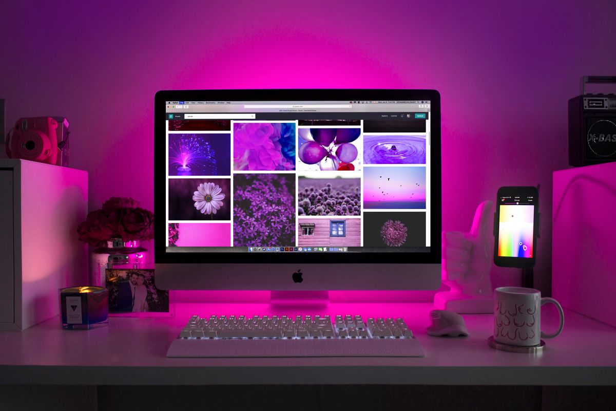
Dark mode crossed the threshold from novelty to expectation in 2026. Users increasingly browse on OLED screens where dark interfaces reduce eye strain and extend battery life, and operating-system-level dark mode preferences are now widespread across iOS, Android, macOS, and Windows. What this means for designers is simple: you can no longer treat dark mode as an optional toggle.
Sites doing this well aren’t simply inverting their light-mode palette. They’re designing two distinct visual systems that share a brand identity. This requires a serious rethink of contrast ratios, shadow behavior, imagery treatment, and color selection. Understanding color theory for web design becomes even more critical in this context — colors that work beautifully on white backgrounds can appear muddy or harsh on dark ones.
Key principles for dark mode done right:
- Use true dark grays (not pure black) as background values to reduce harshness
- Revisit your brand’s accent colors — saturation often needs to be dialed back in dark contexts
- Test all UI states: hover, focus, disabled, error
- Serve separate images or use CSS filters where photography needs to adapt
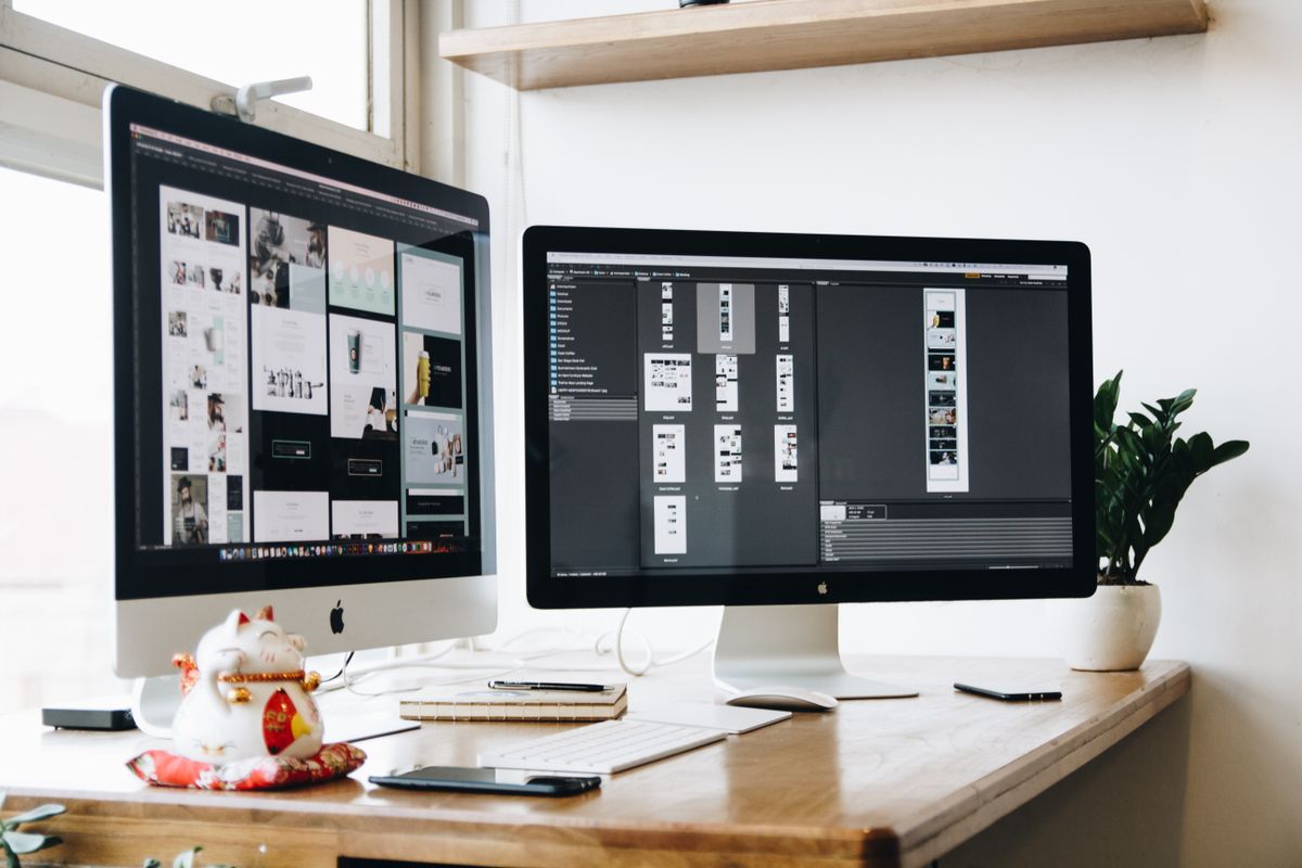
Bento Grid Layouts Are Replacing the Standard Card Grid
Inspired by Japanese bento boxes — and heavily popularized by Apple’s product pages — the bento grid layout has become one of the defining visual styles of 2026. Unlike a uniform card grid, bento layouts use modular, asymmetric blocks of varying sizes that snap together into a cohesive whole. The result feels organized but dynamic, structured but not rigid.
This layout style works especially well for:
- SaaS product feature pages
- Portfolio and agency showcases
- Dashboard UI components
- App landing pages with multiple value propositions
The practical appeal is real. Bento grids let you create visual hierarchy without relying solely on typography — block size itself communicates importance. They also translate well to mobile with thoughtful breakpoint planning, since each module can reflow independently.
Micro-Interactions Are Doing Heavy Lifting
The era of purely static pages is over. In 2026, the best sites feel alive — not because they’re overloaded with animation, but because subtle, purposeful motion responds to user behavior at every step. These are micro-interactions: small, contained animations triggered by specific user actions.
Think of the satisfying bounce when you add an item to a cart, the color shift when a form field validates correctly, or the gentle parallax on a hero image as you scroll. None of these are flashy. All of them reinforce trust, signal responsiveness, and make an interface feel crafted rather than assembled.
What separates good micro-interactions from noise:
- They provide feedback (something happened because of your action)
- They have clear entry and exit states, not just a looping animation
- They’re fast — under 300ms for most UI responses
- They degrade gracefully with
prefers-reduced-motionrespected
CSS animations and the Web Animations API have made these more accessible than ever. You don’t need a JavaScript animation library for most micro-interactions — well-written CSS handles the majority of cases.
AI-Generated Layouts and Personalization Are Entering the Mainstream
The integration of AI into web design isn’t just about tools that help designers work faster — it’s beginning to change the output itself. In 2026, forward-looking sites are experimenting with AI-driven personalization: layouts, content order, and calls to action that shift based on visitor behavior, source, or declared preferences.
This isn’t science fiction. Platforms like Webflow, Framer, and several headless CMS providers are building AI-assisted layout suggestions directly into their products. Meanwhile, e-commerce platforms are deploying AI to surface personalized product arrangements for different audience segments.
For most design teams, the immediate practical application is:
- Using AI tools to generate and test layout variants faster
- Deploying AI-based content recommendation blocks
- A/B testing AI-suggested component arrangements against hand-crafted baselines
The design fundamentals still matter here. AI won’t save a layout with poor typography or confusing navigation — it amplifies what’s already working.
Typography Is Doing More Visual Work
2026 has seen a continuation of the “big type” movement, but with more sophistication. Variable fonts — which allow a single font file to span multiple weights, widths, and optical sizes — are now broadly supported, and designers are using them to create animated and responsive typography that adjusts fluidly based on viewport or scroll position.
Oversized display text, kinetic headlines, and experimental lettering used as graphic elements are all showing up on high-end agency and brand sites. The risk with expressive typography is legibility — which is why pairing choices and hierarchy discipline matter more than ever.
If you’re selecting typefaces for a current project, the guidance in best fonts for websites is a practical starting point for making decisions that hold up across contexts.
What to Watch in Typography
- Variable font usage in scroll-driven animations
- Serif fonts making a strong comeback in brand contexts
- Tight, oversized headlines paired with spacious body text
- Fewer font families per project (one or two, used boldly)
Accessibility Is a Design Trend, Not Just a Compliance Checkbox
WCAG 2.2 became the official standard in late 2023, and its influence on design decisions in 2026 has been significant. More importantly, designers and stakeholders are beginning to internalize that accessible design is simply good design — higher contrast ratios improve readability for everyone, logical focus order helps keyboard users but also benefits touch navigation, and clear error states reduce friction for all visitors.
Teams that treat accessibility as a constraint tend to bolt it on at the end and struggle. Teams that design with it from the start find that it pushes them toward cleaner, more intentional decisions.
Bringing It Together
The trends dominating 2026 share a common thread: intentionality. Dark mode, bento grids, micro-interactions, AI personalization, expressive typography, and accessible design aren’t individual checkboxes — they’re all expressions of a broader shift toward experiences that feel deliberate, responsive, and human. The sites that stand out this year aren’t the ones chasing every trend; they’re the ones that understand why a trend works and apply it with discipline.
If you’re planning a redesign or building something new and want expert eyes on the direction, we’d love to help. Get in touch with the team at blogthememachine.com or subscribe to our newsletter for weekly insights on web design, SEO, and digital strategy delivered straight to your inbox.